
Why Does Everything Look Like That?
2025 is the year of things looking bad.

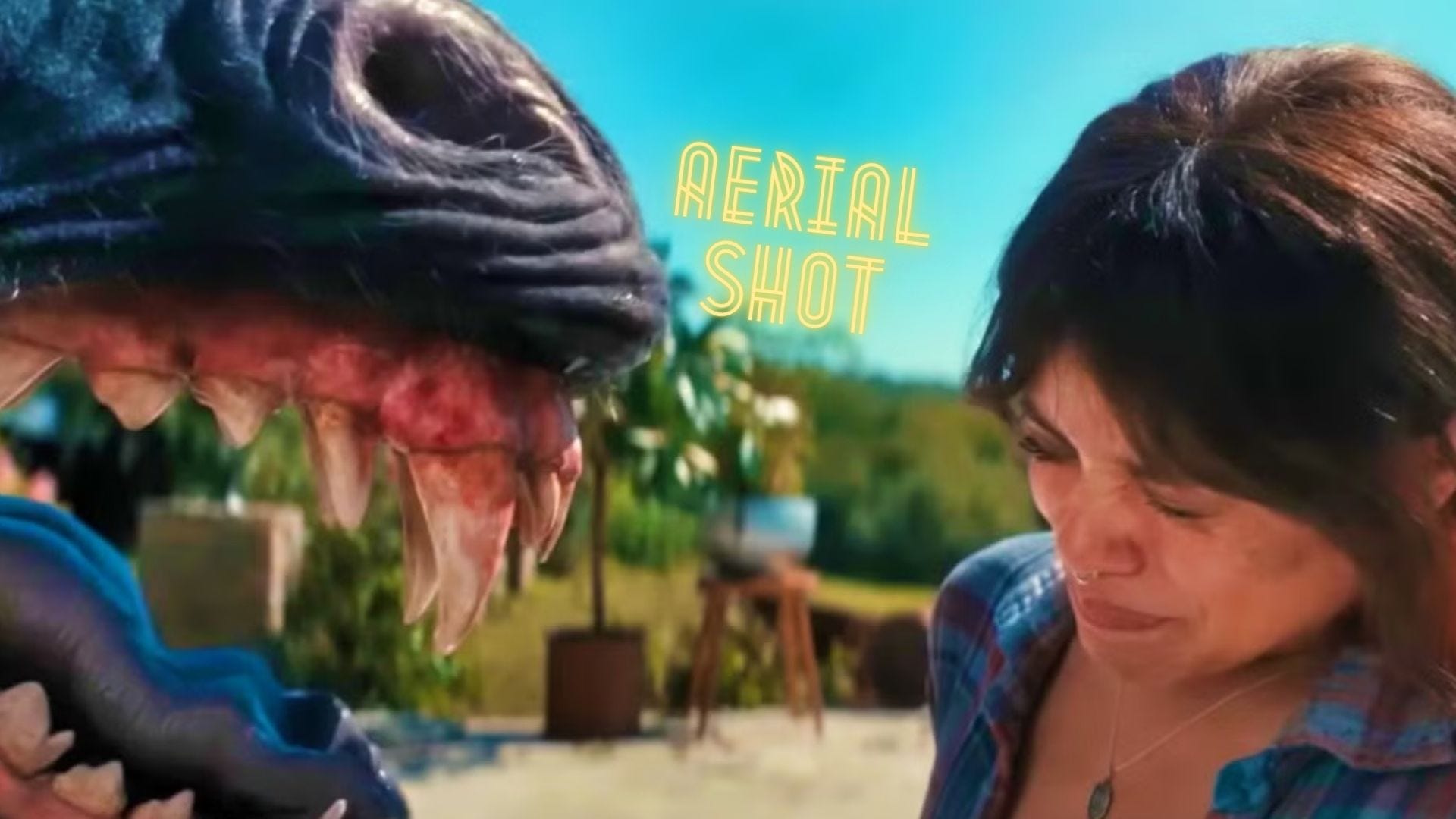
There’s been a common take going around that Death of a Unicorn is a modern-day riff on Jurassic Park and Jaws. Which, I mean, I guess it is in the loosest sense. I saw that review on Letterboxd (of course) but also on Polygon, on RobertEbert.com and even on IndieWire.
There’s no question that this horror/comedy is inspired by early Steven Spielberg, but there’s a big difference: One looks good and one looks like shit.
I’m obviously not insulting Steven Spielberg, so the brunt of that attack has to go to director Alex Scharfman and the rest of the team that made Death of a Unicorn look so flat. It starts with the script, which is mostly lazy and features a bunch of half-assed jokes and semi-timely jabs at the healthcare industry, and that insipid writing goes straight to the filmmaking itself, which could easily be turned into an episode of a middling Netflix show.
To be fair, it’s far from the only recent movie that looks so dull, from “big-ticket” items like Captain America: Brave New World and The Electric State, which have similar sheens to recent middling action fare such as Novocaine and The Gorge. All have been made on different timetables but feel wounded by the COVID era in filmmaking, which then immediately shifted into the WGA/SAG strikes. It’s been tough to pull something together, especially with the bigger names that all of these movies have, and yet, we have to call it out. Or else, this is all we’re going to get.
I watched the new Snow White in theaters for some reason the other night—don’t make the same mistake I did—and I immediately texted some friends that it looked like a Mint Mobile commercial. Every scene is an actor (or a group of actors) staring and singing at each other over a table with digitally-enhanced wallpapers behind them. There’s no depth to the screen. You can almost see the digital makeup peaking out of every orifice.

Just look at the color-grading difference between these two images. The filmmakers of the 2025 version wanted everything to look so lifelike that it took all of the joy and animation out of the Snow White story.


The Disney flop apparently cost $213.9 million to make, and it doesn’t look any better than the following Instacart Super Bowl commercial…
Honestly, you could tell me that the same team is behind Snow White and this generic ad, and I’d believe it.
I think this take from Reddit gets to the core of it. Things look too clean and immaculate now, especially when shot on digital.
I actually think it looks too "perfect". Everyone is lit perfectly and filmed digitally on raw and tweaked to perfection. It makes everything have a fake feeling to it. Commercials use the same cameras and color correction so everything looks the same. Every shot looks like it could be used in a stock photo and it looks completely soulless.
No film grain, no shadows on faces, and no wide shots. I have a theory that going from tungsten to led lightning added to this as well. Tungsten allows for more accurate color in camera but LEDs are cheaper, cooler, and more convenient. So the solution is to film on a nice digital camera and fix the color in post. However, this makes for less creativity on set and less use of shadows.
Green screens make it worse as they also require flatter lighting to work. Marvel films are very obviously mostly made in post and they all look very flat and not real. Even shitty low budget 90's comedies look better and I think this can be attributed to the lighting.
I think the reason we see less wide shots is because cinematographers today are all going for beauty shots which is easier to do with a close up or a medium shot. It's actually exhausting to see a lot of close ups in a movie and leaves people less engaged. Close ups should be used sparingly for important moments. They are used frequently for commercials because they are trying to tell a "story" very quickly so they show a big smiling face and cut to a sandwich. That's what these straight to streaming commercials look like. Sandwich commercials.
I don’t want to say “the good ol’ days” because there was a lot of garbage being made back then as well, but over the last few weeks or so, I watched Hard Eight (1996), Nashville (1975) and The Royal Tenenbaums (2001), and all of these movies looked like they took place in the real world, not in a neutered reality zapped of any spark.
Even something like 1988’s Coming to America, which is a straight comedy that isn’t too focused on visual flourishes, looks much better than any of the new movies named above. The characters aren’t photoshopped into oblivion. You can see pores on faces. And there’s even a bit of sweat and dirt, all allowing the audience to settle in.
It’s not all doom and gloom. The new Steven Soderbergh spy thriller Black Bag is gorgeous and emphasizes mood lighting in a way that ups the tension and dire circumstances. The color palette centers the zigzagging plot and adds to the uncertainty over what will happen from scene to scene. I mean, these photos are gorgeous and not even in the best resolution.


And then, there’s something like the new One Battle After Another trailer, which is the most excited I’ve been about a movie in a long time.
There’s a sense of grit and mustiness from the opening shot of this Paul Thomas Anderson movie that gives you a sense of the story to come and the people involved. It doesn’t look sanitized into oblivion. Things are messy, and they’re going to stay that way.
In summation, don’t give up. Expect (and want) good things, and you’ll get them. Not every movie can/will be Jaws or Jurassic Park, but we should at least expect our filmmakers to want to make real, tangible things.
That’s it. End of rant.